
# table组件示例
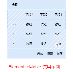
📊 定制化el-table表格的高级魔法
在这一篇,我们将探讨如何使用el-table来打造上面截图中的神奇表格,而且我们要把它变得更有趣!
- 🛠️ el-table入门:让表格有味道
- ➕➖ 可增减行:灵活操作,轻松搞定
- 🧩 字段自定义:表格随你心动
- 🎨 按钮自定义:掌握表格的控制权
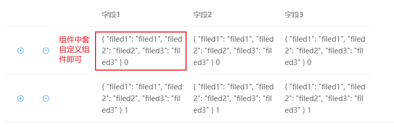
# 组件中自定义
# 整体方案
🖍️ 灵活可编辑的组件,可添加行与列:
引入与使用:
<!-- 引入组件,传入数据即可 -->
<dataTable :tableData="tableData"></dataTable>
<!-- tableData:any[] = [{"filed1": "filed1", "filed2": "filed2", "filed3": "filed3"}] -->
2
3
模板示例:
<template>
    <div>
        <el-table
            :data="tableData"
            style="width: 100%">
            <el-table-column
            label=""
            width="180">
                <template slot-scope="scope">
                    <div>
                        <el-button @click="addCol(scope.$index)" type="text" icon="el-icon-circle-plus-outline" circle></el-button>
                        <el-button @click="deleteCol(scope.$index)" type="text" icon="el-icon-remove-outline" circle></el-button>
                    </div>
                </template>
            </el-table-column>
            <el-table-column
            label="字段1"
            width="180">
                <template slot-scope="scope">
                    <div class="flex-container">
                        <div>{{ scope.row}} {{scope.$index}} {{ index}}</div>
                    </div>
                </template>
            </el-table-column>
            <el-table-column
            label="字段2"
            width="180">
                <template slot-scope="scope">
                    <div class="flex-container">
                        <div>{{ scope.row}} {{scope.$index}} {{ index}}</div>
                    </div>
                </template>
            </el-table-column>
            <el-table-column
            label="字段3"
            width="180">
                <template slot-scope="scope">
                    <div class="flex-container">
                        <div>{{ scope.row}} {{scope.$index}} {{ index}} </div>
                    </div>
                </template>
            </el-table-column>
        </el-table>
    </div>
</template>

<script lang="ts">
import { Vue, Component, Prop, Emit } from 'vue-property-decorator';

@Component({
    components: {
    }
})

export default class DataTable extends Vue {
    @Prop()  tableData!: any[];

    private deleteCol(index: number) {
        this.tableData.splice(index, 1);
        if (this.tableData.length === 0){
            this.addCol(-1);
        }
    }

    private addCol(index: number) {
        let newRow = this.newDefaultCol();
        let insertIndex = this.getInsertIndex(index)
        this.tableData.splice(insertIndex, 0, newRow);
    }

    private newDefaultCol():any {
        return { "filed1": "filed1", "filed2": "filed2", "filed3": "filed3" };
    }

    private getInsertIndex(index: number) {
        if (index == -1) {
            return 0
        }
        return index + 1
    }
}
</script>

<style lang="less" scoped>


</style>
2
3
4
5
6
7
8
9
10
11
12
13
14
15
16
17
18
19
20
21
22
23
24
25
26
27
28
29
30
31
32
33
34
35
36
37
38
39
40
41
42
43
44
45
46
47
48
49
50
51
52
53
54
55
56
57
58
59
60
61
62
63
64
65
66
67
68
69
70
71
72
73
74
75
76
77
78
79
80
81
82
83
84
85
86
87
# 优缺点
优点
- 实现简单
缺点
- 组件无法公用,类似表格的组件都需要开发一套
- 字段无法拓展,内容僵化
- 业务逻辑都在一个页面代码量大
# 开放自定义
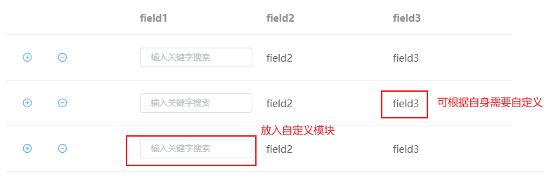
📄 自定义表格内容,轻松搞定
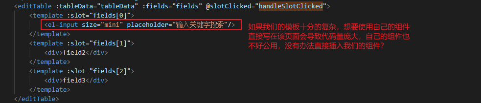
在这里,我们可以随心所欲地定制表格中的内容,但值得一提的是,这些内容并不会被直接放置在当前组件内。
# 整体方案
提供插槽的方式,让用户自己传入:
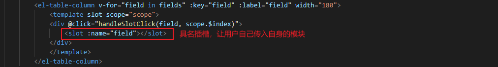
如何让外部组件知道我们到底点击了,哪个格子?

如何使用组件?
<editTable :tableData="tableData" :fields="fields" @slotClicked="handleSlotClicked">
    <template :slot="fields[0]">
        <el-input size="mini" placeholder="输入关键字搜索"/>
    </template>
    <template :slot="fields[1]">
        <div>field2</div>
    </template>
    <template :slot="fields[2]">
        <div>field3</div>
    </template>
</editTable>

export default class DataDriven extends Vue {
	...
    private handleSlotClicked(payload: { field: string; index: number }) {
        // 在这里处理插槽被点击时的逻辑,可以获取到 field 和 index
        console.log('Slot clicked in parent:', payload.field, payload.index);
    }
}
2
3
4
5
6
7
8
9
10
11
12
13
14
15
16
17
18
19
自定义模板代码:
<template>
    <div>
        <el-table
            :data="tableData"
            style="width: 100%">
            <el-table-column
            label=""
            width="180">
                <template slot-scope="scope">
                    <div>
                        <el-button @click="addCol(scope.$index)" type="text" icon="el-icon-circle-plus-outline" circle></el-button>
                        <el-button @click="deleteCol(scope.$index)" type="text" icon="el-icon-remove-outline" circle></el-button>
                    </div>
                </template>
            </el-table-column>
            <el-table-column v-for="field in fields" :key="field" :label="field" width="180">
                <template slot-scope="scope">
                <div @click="handleSlotClick(field, scope.$index)">
                    <slot :name="field"></slot>
                </div>
                </template>
            </el-table-column>
        </el-table>
    </div>
</template>

<script lang="ts">
import { Vue, Component, Prop, Emit } from 'vue-property-decorator';

@Component({
    components: {
    }
})

export default class DataTable extends Vue {
    @Prop()  tableData!: any[];
    @Prop()  fields!:string[];

    private deleteCol(index: number) {
        this.tableData.splice(index, 1);
        if (this.tableData.length === 0){
            this.addCol(-1);
        }
    }

    private addCol(index: number) {
        let newRow = this.newDefaultCol();
        let insertIndex = this.getInsertIndex(index)
        this.tableData.splice(insertIndex, 0, newRow);
    }

    private newDefaultCol():any {
        return {};// 默认行为空数据,需要组件外部,处理并赋值
    }

    private getInsertIndex(index: number) {
        if (index == -1) {
            return 0
        }
        return index + 1
    }

    private handleSlotClick(field: string, index: number) {
        // 处理插槽被点击时的逻辑,可以在这里获取到 field 和 index
        console.log('Slot clicked:', field, index);
        // 触发自定义事件,将 field 和 index 传递给父组件
        this.$emit('slotClicked', { field, index });
    }
}
</script>

<style lang="less" scoped>

</style>
2
3
4
5
6
7
8
9
10
11
12
13
14
15
16
17
18
19
20
21
22
23
24
25
26
27
28
29
30
31
32
33
34
35
36
37
38
39
40
41
42
43
44
45
46
47
48
49
50
51
52
53
54
55
56
57
58
59
60
61
62
63
64
65
66
67
68
69
70
71
72
73
74
# 优缺点
优点
- 组件可公用,可自定义字段
缺点
- 需要一定使用的基础,开发进展较慢
# 拓展
🧩 优雅应对复杂组件的字段管理
在我们庞大的组件家族中,有时候字段多到数不胜数,你是否感到有点眼花缭乱呢?别担心,小编为你献上应对之道!
🗺️ Map[key]模板:巧妙字段映射
当组件变得复杂时,我们可以巧妙地运用Map[key]的模板方式。通过使用for循环,将我们自定义的字段和组件模板巧妙地映射起来。这样一来,就能轻松填充组件到模板中,让一切井然有序。
🔄 for循环:简便字段映射过程
采用for循环,我们可以迅速而简便地完成字段与组件的映射工作。这不仅提高了代码的可维护性,还让你在组件众多的情况下游刃有余。
无论组件有多复杂,采用这样的映射策略,你都能轻松管理和使用各种字段,让你的代码清晰明了。
以下是
ChatGPT给的解决方案:
你可以使用一个映射(Map)来将字符串键映射到不同的 Vue 组件,并根据键的值在你的 Vue 代码中动态地选择要显示的组件。这通常通过使用动态组件 (<component>) 和 :is 特性来实现。
下面是一个简单的例子,演示如何使用映射来切换不同的组件:
<template>
  <div>
    <component :is="componentMap[currentComponentKey]" />
    <!-- 这里可以添加其他内容 -->
  </div>
</template>

<script lang="ts">
import { Vue, Component } from 'vue-property-decorator';
import ComponentA from '@/components/ComponentA.vue'; // 导入你的组件
import ComponentB from '@/components/ComponentB.vue';

@Component({
  components: {
    ComponentA,
    ComponentB,
    // 其他可能的组件
  },
})
export default class DynamicComponent extends Vue {
  private currentComponentKey: string = 'componentA'; // 默认显示 ComponentA

  private componentMap: Map<string, any> = new Map([
    ['componentA', ComponentA],
    ['componentB', ComponentB],
    // 添加其他组件到映射
  ]);

  // 通过方法或其他逻辑动态改变 currentComponentKey 的值
  private switchComponent(key: string) {
    this.currentComponentKey = key;
  }
}
</script>

<style lang="less" scoped>
</style>
2
3
4
5
6
7
8
9
10
11
12
13
14
15
16
17
18
19
20
21
22
23
24
25
26
27
28
29
30
31
32
33
34
35
36
37
38
在上面的例子中,我们使用 componentMap 映射字符串键到对应的组件。然后,通过在 <component> 标签上使用 :is 特性,我们可以动态地选择要渲染的组件。
你可以在需要的时候通过调用 switchComponent 方法或者其他逻辑来改变 currentComponentKey 的值,从而动态切换显示的组件。这种方式对于根据特定条件在运行时切换组件非常有用。